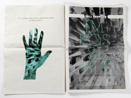
Ran across the amazing work of Bob Case, illustrator and designer.
design
Olympic Logo Design
With all of the Olympic craze going around lately, I thought I’d highlight some of the design that goes into the games. Let’s just start out by agreeing that the logo for the 2012 London Olympics is not exactly gorgeous. In fact, it’s far from something that really represents London or athletics or the Olympics.
But then again, look out these designs below from the 1968 Olympics or the even the 1924 Olympics. Definitely aren’t going to be winning any design awards. To see the logo evolution over the years, check out [88 Olympic Logos]. Pretty crazy to see how bad some of the design really is – there aren’t a ton of logos on there that I would particularly like to enlarge and display somewhere. Typography never seems to be very strong in any of the logos and the colors or shapes that are decided on to express the home country sometimes seem haphazard.
The ones that stand out the most to me out of that line up are 1976 Montreal, 2002 Salt Lake City and Vancouver 2010.
There are, however, lots of designers who have chosen to tackle their own design for the Olympic Games. Check back tomorrow for some highlights of those logos!
In other Olympic related design, have you seen GoSquared’s live infographic of some of the numbers important to the Olympic games? Really interesting way to display the information and utilize scrolling. Not to mention they included how much was spent on the Olympic logo design – 400,000 pounds! Yikes!
I’m back!
It’s Official: Department of Design from Leo Burnett Worldwide on Vimeo.
Brand Identity + Company Logos
This is a video in which Adam Ladd asked his 5 year old daughter to name the type of company or name of the company based on the logos that he showed her. I’m sure many of you have seen it floating around the internet lately. Interesting example of what stands out to little kids.
Companies can spend millions upon millions of dollars developing a brand image for themselves and when it comes down to it, it’s all about customer recognition. It could be the most innovative logo ever but if people can’t remember what the company is or what they sell, it’s essentially useless.
In this second video, Adam showed his daughter a series of logos that she had never seen before. She was then asked to draw them from memory after looking at them for 5 seconds. Again, it’s interesting to see what stands out. Logos do not and should not be overly complex. Their purpose is to give an image or identity to a company that people will recognize even if they only see it briefly.
I’ve recently downloaded an App on my iPhone that is a “guess this logo” game (okay, I’m a huge nerd). The majority of them are logos that I can name right off the bat but a few trip me up even if it’s something that I vaguely recognize.
Owen Gildersleeve – Designer and Illustrator
Owen Gildersleeve is a designer and illustrator from London. Much of his work deals with very hand-crafted pieces (cut paper, stop motion animation, etc). Really love the dimensionality that using cut paper gives. It’s a great mix between paper, photography and real objects.
I believe I might have already featured this Brunch piece before but it’s just so great! I love all of the different textures and depths that start happening throughout it.
And last but not least, how is this for a book cover?
This work mixed with the work that I showcased yesterday from Dominique Falla makes me want to definitely test out some new forms of typography and break out of the realm of traditional computer type. There are so many different options and cool things out there that you can do with just ordinary objects.
The rest of his work can be found on Owen’s website.
Dominique Falla
I was introduced to the work of Dominique Falla the other day and immediately fell in love with her process work. Don’t get me wrong, her finished work is beautiful but what stands out the most is the level of detail and care that goes into each one through the entire process. I love the a few of her projects include videos of the behind the scenes work to really highlight all of the work that goes into it from the sketching phases right on up!
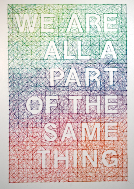
I’ve picked out three of my favorites here below. There are MANY more pieces to look at on Dominique’s website so definitely make sure you go check them out. She seems to be able to experiment with multiple mediums from string and pins to traditional print, gum and even matchsticks.
Gorgeous, right? The rest of her work can be found here. If you’re anything like me, you’re probably going to want to get your hands on some paper and pencils to start sketching some typography right away.
Thanks to ComicSansSheriff for the recommendation!
Jessica Decker – Designer
Jessica Decker is a graphic designer from Detroit, Michigan. A lot of her work deals with editorial pieces although she has some really interesting cross stitching work on giant posters. Loving the way typography is treated throughout all of her work. It all has a very elegant, intentional feel about it. Especially loving all of the experimental work with typography.
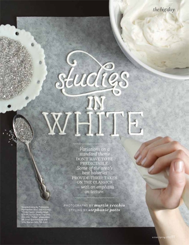
This “studies in white” was actually the piece that initially drew me to Jessica’s work. I love typography that is hand-done using materials you wouldn’t necessarily think of. This is a gorgeous example of it! Itching to try out some experimental typography of my own.
Definitely check out the rest of her work here.
Design Is…
Pantone Colors
Spring Quarter – RIT
This next quarter is my LAST one at RIT. Kind of crazy to think about, considering in my head I’m still a sophomore.. or applying for college. I’m definitely going to be taking advantage of these next 11 weeks to make some sweet work & really get all that I can out of the rest of my time here.
Today I had Career Search class which deals with personal branding, our website, promotional pieces, etc. It’s always fun to redesign my own collateral because it’s the one time you’re the boss & get to decide everything without asking! Plus it’s like having a client around all of the time (I believe I’m on redesign numero 4?). Also had my Advanced Design Networking class this morning which is in New Media design + will be focused on iPhone/website interactivity. Super pumped for that class.
I did get a chance to work on my own personal website over break but I’m still not 100% happy with it (I’m starting to think that’s a reoccurring theme..). But I’ve noticed the more I redo it, the more comfortable I am getting with coding. Win-win?


